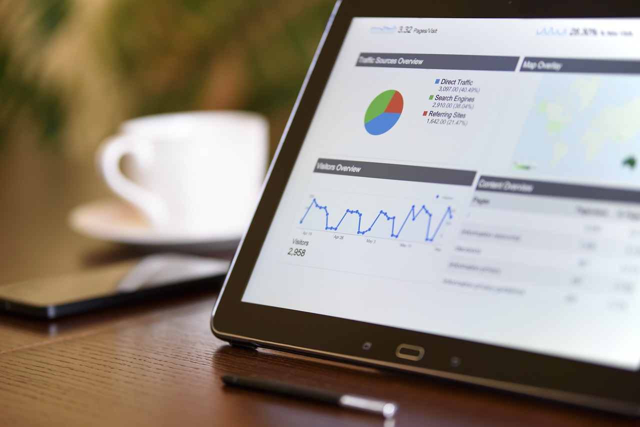
Have you ever wondered how professionals turn complex data into visual stories that anyone can understand? In today’s data-driven world, the ability to present information effectively and interactively is crucial. That’s where interactive dashboards come into play! They allow you to visualize data in a user-friendly format, and tools like Plotly Dash and Streamlit make this process more accessible than ever.
What Are Interactive Dashboards?
An interactive dashboard is a visual representation of key performance indicators (KPIs) and other critical data that helps you make decisions based on real-time insights. Unlike static reports, interactive dashboards allow users to engage with the data, adjusting filters and parameters to see how different variables influence outcomes.
Imagine having a central hub where you can click through various metrics, manipulate data views, and quickly glean insights. That’s the power of interactive dashboards! With them, you enhance your analytical capabilities and foster a more proactive approach to data analysis.
Importance of Interactive Dashboards
The significance of interactive dashboards cannot be overstated! They serve several essential functions for both organizations and individuals:
- Quick Decision-Making: You can easily spot trends and make informed decisions promptly.
- Better Data Understanding: Visualizations help simplify complex data, making it easier for you to grasp essential insights.
- Enhanced Collaboration: Keeping everyone on the same page is easier when you can present data visually and interactively.
Introduction to Plotly Dash
Plotly Dash is one of the most popular frameworks for building interactive dashboards. Built on top of Flask, Plotly, and React, Dash empowers you to create web-based dashboards using Python. Unlike other frameworks, Dash allows you to construct a fully functional dashboard without needing extensive web development experience.
Key Features of Plotly Dash
You might be curious what makes Dash such a robust choice for data visualization. Here are a few standout features:
- Integration with Plotly Graphing Library: You can create beautiful, customizable charts that are highly interactive.
- Pythonic Syntax: You can leverage your existing Python knowledge to build applications quickly.
- No JavaScript Knowledge Required: Unlike many dashboard frameworks, you don’t have to learn JavaScript to utilize Dash.
Installing Plotly Dash
To start using Dash, you’ll need to install it in your Python environment. You can easily do this with pip, the package installer for Python:
pip install dash
Once you have Dash installed, you’re on your way to creating engaging dashboards!
Building Your First Dash App
Creating a simple Dash app involves importing the necessary libraries, defining your layout, and running the server. Here’s a basic example to get you started:
import dash import dash_core_components as dcc import dash_html_components as html
app = dash.Dash()
app.layout = html.Div(children=[ html.H1(children=’My First Dash App’), dcc.Graph( id=’example-graph’, figure={ ‘data’: [ {‘x’: [1, 2, 3], ‘y’: [4, 1, 2], ‘type’: ‘bar’, ‘name’: ‘A’}, {‘x’: [1, 2, 3], ‘y’: [2, 4, 5], ‘type’: ‘bar’, ‘name’: ‘B’}, ], ‘layout’: { ‘title’: ‘Sample Data Visualization’ } } ) ])
if name == ‘main‘: app.run_server(debug=True)
In this example, you create a simple dashboard that displays a bar chart. You can gradually enhance this app by adding interactivity like dropdowns, sliders, and callbacks.
Understanding Callbacks
Callbacks are one of the most powerful features of Dash, enabling you to create interactive elements in your dashboard. They allow you to update the dashboard dynamically based on user input. Here’s how it works:
- Inputs and Outputs: Define what elements users will interact with (inputs) and what parts of the dashboard will update (outputs).
- Function Definitions: Write functions that define how the outputs should change based on the inputs.
For instance, if you have a dropdown menu that lets users select a category, you can set up a callback that updates the graph accordingly.

Introduction to Streamlit
If you’re looking for another option for creating interactive dashboards, Streamlit is a fantastic alternative. Streamlit is designed for building web applications quickly and is remarkably user-friendly, especially if you’re already familiar with Python.
Key Features of Streamlit
Streamlit has become popular for its simplicity and effectiveness. Here’s a glimpse of its key features:
- User-Friendly API: The straightforward API allows you to write less code and create beautiful dashboards quickly.
- Real-Time Updates: Changes you make are immediately reflected in the dashboard without the need for complex callbacks.
- Built-in Components: From charts to maps, Streamlit comes with various components that you can use right out of the box.
Installing Streamlit
To get started with Streamlit, all you need to do is install it using pip:
pip install streamlit
Once it’s installed, you are ready to create your interactive applications!
Building Your First Streamlit App
The process for building a Streamlit app is incredibly streamlined. You just need to focus on writing your Python code. Here’s a simple example of a Streamlit dashboard:
import streamlit as st import pandas as pd import numpy as np
st.title(‘My First Streamlit App’)
data = pd.DataFrame( np.random.randn(10, 2), columns=[‘a’, ‘b’] )
st.line_chart(data)
With this code, you generate a basic dashboard that displays a line chart of random data. The beauty of Streamlit lies in its simplicity, letting you focus on what matters most.
Adding Interactivity in Streamlit
Streamlit makes it easy to add interactivity using widgets like sliders, buttons, and text inputs. For example, you could ask users to select a number with the following line of code:
number = st.slider(‘Select a number’, 0, 100) st.write(‘You selected:’, number)
This small code snippet allows users to choose a number between 0 and 100, and displays their selection immediately.
Comparing Plotly Dash and Streamlit
Both Plotly Dash and Streamlit have their strengths, and choosing between them often depends on your specific use case. Here’s a head-to-head comparison of their features:
| Feature | Plotly Dash | Streamlit |
|---|---|---|
| Ease of Use | Requires a bit more setup and understanding of web frameworks | Very easy, beginner-friendly |
| Customization | Highly customizable with CSS and JS | Limited customization; focuses on simplicity |
| Real-Time Data | Supports real-time updates with callbacks | Supports real-time updates naturally |
| Visualizations | Built-in support for Plotly charts | Many visualization libraries can be integrated |
| Learning Curve | Moderate learning curve, especially with callbacks | Minimal learning curve |
Ultimately, your choice will depend on your goals, technical skills, and the specifics of the project you’re working on. Some might prefer the extensive customization that Dash offers, while others may lean towards the simplicity and speed of Streamlit.

Integrating Other Libraries with Plotly Dash
Enhancing your Dash applications with additional libraries can vastly improve their functionality. You can integrate libraries such as Pandas for data manipulation, SQLAlchemy for database interactions, and Flask for more complex routing needs.
Using Pandas
Pandas is a powerful data analysis and manipulation library in Python. You can use it to preprocess and clean your data before visualizing it in your Dash app. Here’s a quick example:
import pandas as pd
Load dataset
data = pd.read_csv(‘data.csv’)
Process data
processed_data = data.groupby(‘category’).sum()
Use processed_data in your Dash app
This preprocessing step is crucial if you want to present relevant insights based on user interactions.
Using SQLAlchemy
If your data comes from a database, integrating SQLAlchemy allows for smooth data retrieval in your Dash applications. Here’s a simple way to query your database:
from sqlalchemy import create_engine
engine = create_engine(‘sqlite:///your_database.db’) data = pd.read_sql(‘SELECT * FROM your_table’, engine)
With SQLAlchemy, you can handle complex queries and ensure your dashboards are pulling correct and up-to-date data.
Real-World Applications of Dashboards
Both Plotly Dash and Streamlit have been utilized in various industries and domains. Let’s explore some real-world applications:
Business Intelligence
Dashboards play an essential role in business intelligence, allowing stakeholders to track performance metrics and KPIs easily. Companies can use interactive dashboards to visualize sales figures, customer feedback, and market trends.
Health Sector
In healthcare, dashboards enable professionals to visualize patient data, track treatment outcomes, and monitor resource allocation effectively. This facilitates informed decision-making and improves patient care.
Marketing Analytics
Marketing teams leverage dashboards to analyze campaign performance, website traffic, and social media engagement. Using tools like Dash and Streamlit, they can navigate through complex analytics and derive actionable insights.
Education
In educational settings, dashboards help administrators visualize student performance, attendance, and engagement metrics. This data can assist in developing strategies to improve learning outcomes.

Best Practices for Creating Interactive Dashboards
When creating interactive dashboards, following certain best practices can enhance their effectiveness and user experience. Here are some guidelines to consider:
Keep It Simple
Avoid cluttering your dashboard with too much information. Simplicity promotes better understanding. Focus on key metrics and provide the necessary context.
Use Consistent and Intuitive Terminology
Make sure your dashboard uses consistent terms and visual elements throughout. Aim for user familiarity, making navigation seamless.
Provide Interactivity Wisely
While interactivity is a major feature, too many toggles and buttons can overwhelm users. Focus on what truly adds value to the user experience and make interactions meaningful.
Consider Responsiveness
Ensure your dashboard is responsive, meaning it will work well across different devices and screen sizes. This improves accessibility and user experience.
Test with Real Users
Gather feedback from potential users before finalizing your dashboard. Real-world input ensures your design meets their needs and fosters better decision-making.
Conclusion
Interactive dashboards have changed how you analyze and present data, making it more intuitive and impactful. With tools like Plotly Dash and Streamlit, you can create compelling visualizations that bring your data to life.
As you embark on your journey of creating interactive dashboards, remember to keep learning and experimenting. Each project will deepen your understanding and help you refine your skills. Whether you opt for Dash’s flexibility or Streamlit’s simplicity, you’ll be well on your way to harnessing the power of data to tell a meaningful story. Happy coding!
